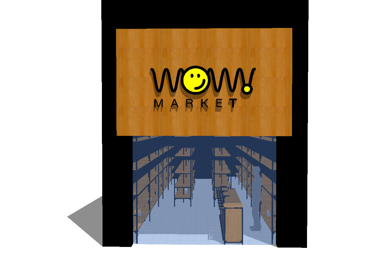
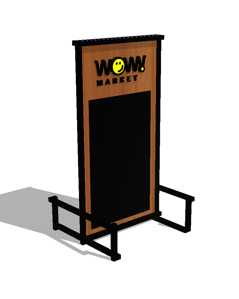
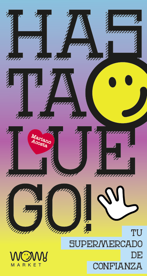
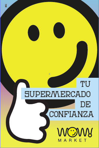
Comprehensive design for a mini supermarket chain, including brand design and applications, signage and furniture such as shelves and boxes. The idea for the brand was to play with the waves of the word "wow" adding the smile as an element of friendliness, it is a local supermarket, in which the customer service policy is relaxed and friendly. The branding would always be used in two colors, yellow and black, ensuring impact at a low implementation cost.
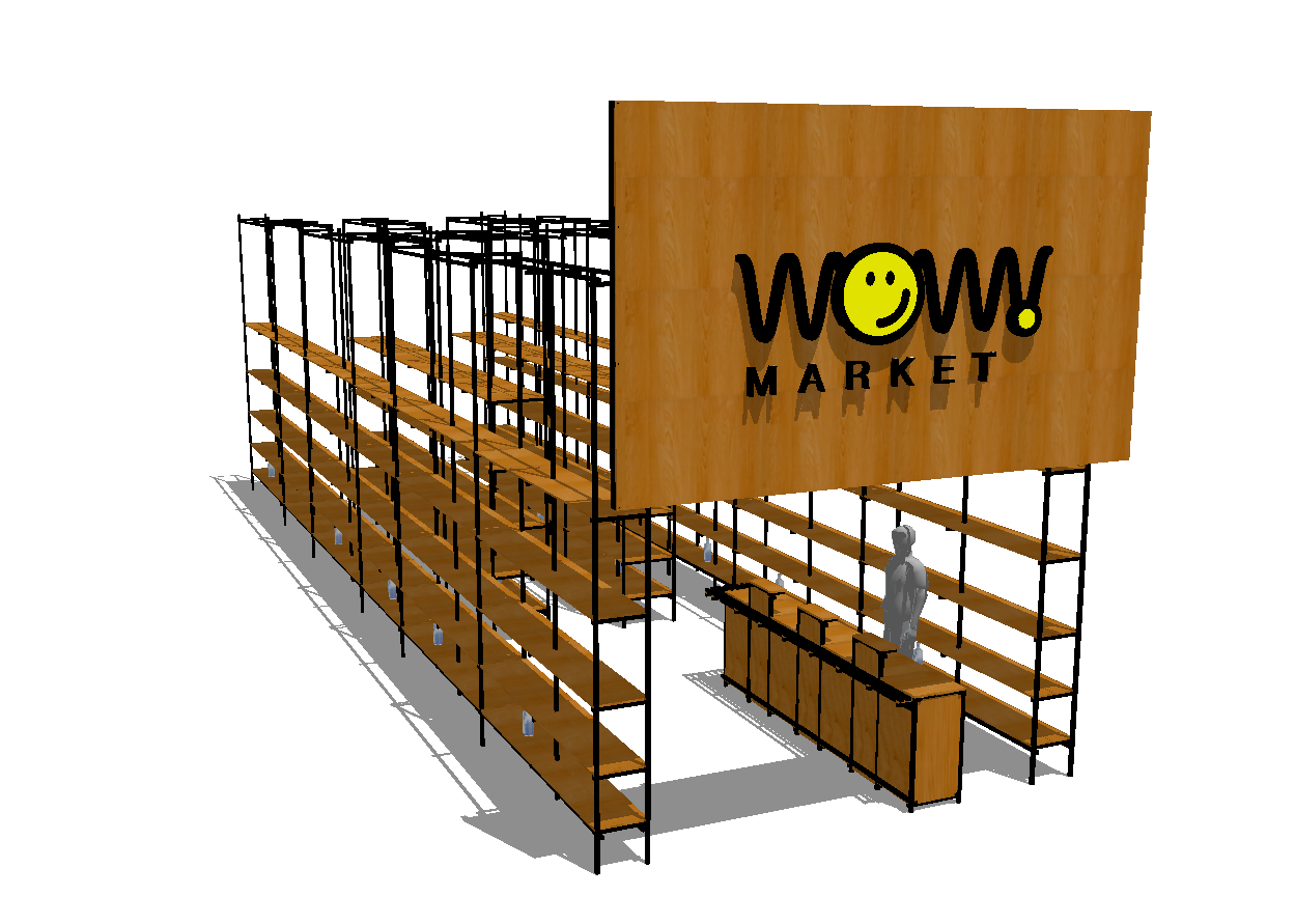
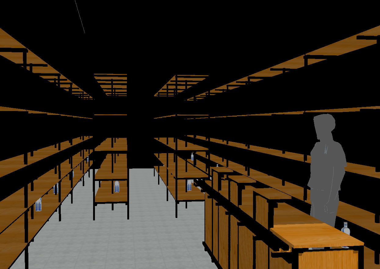
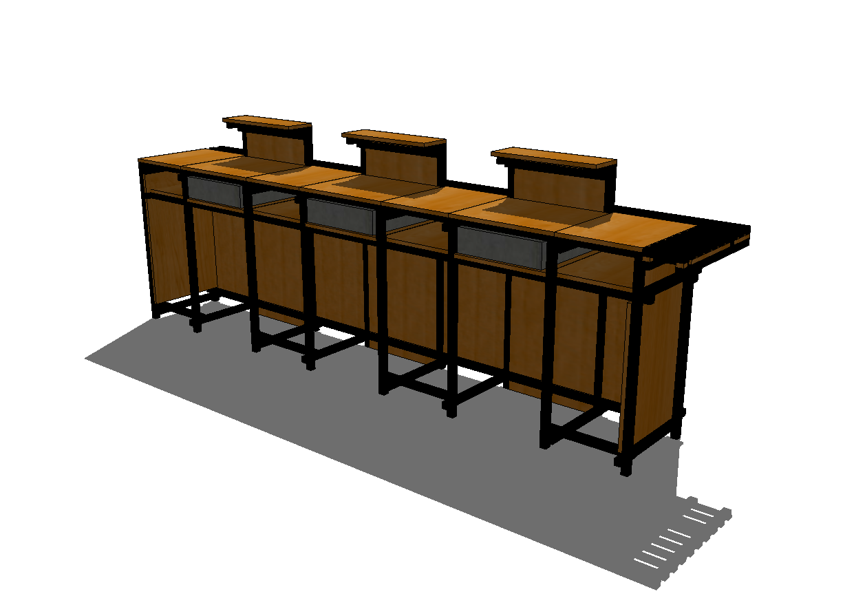
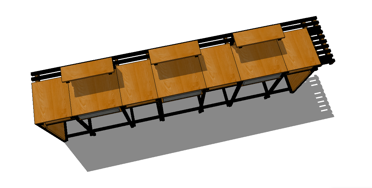
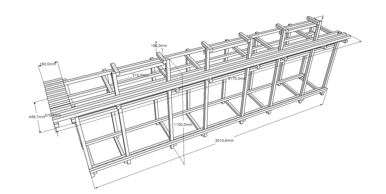
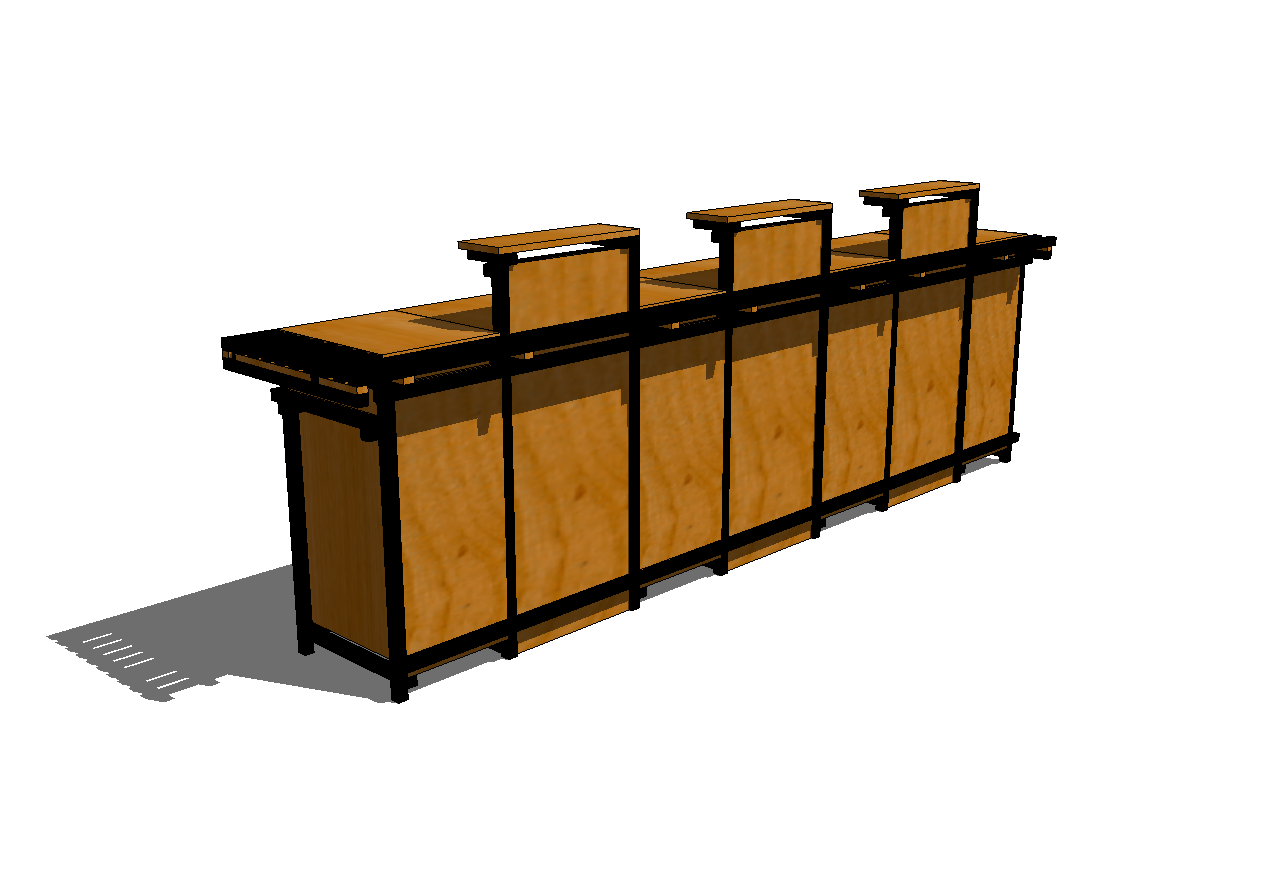
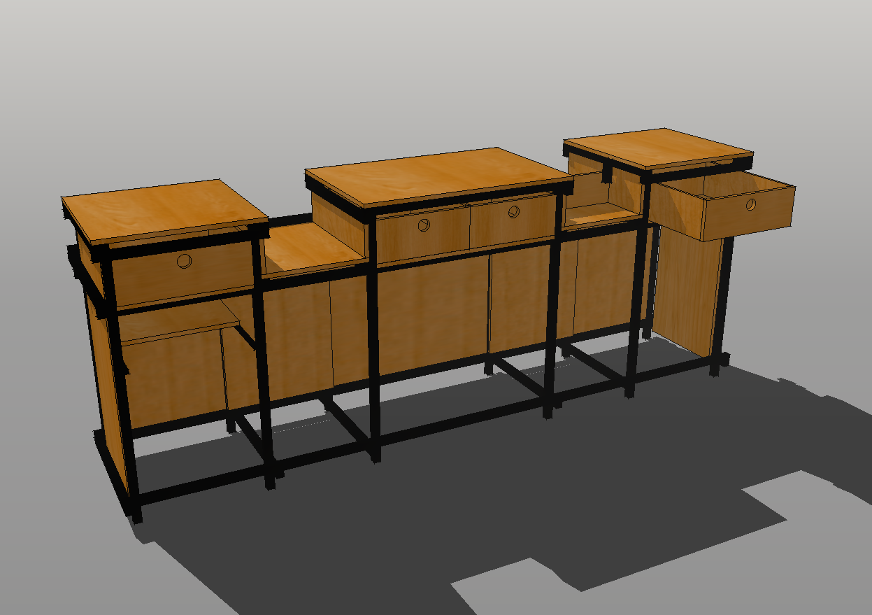
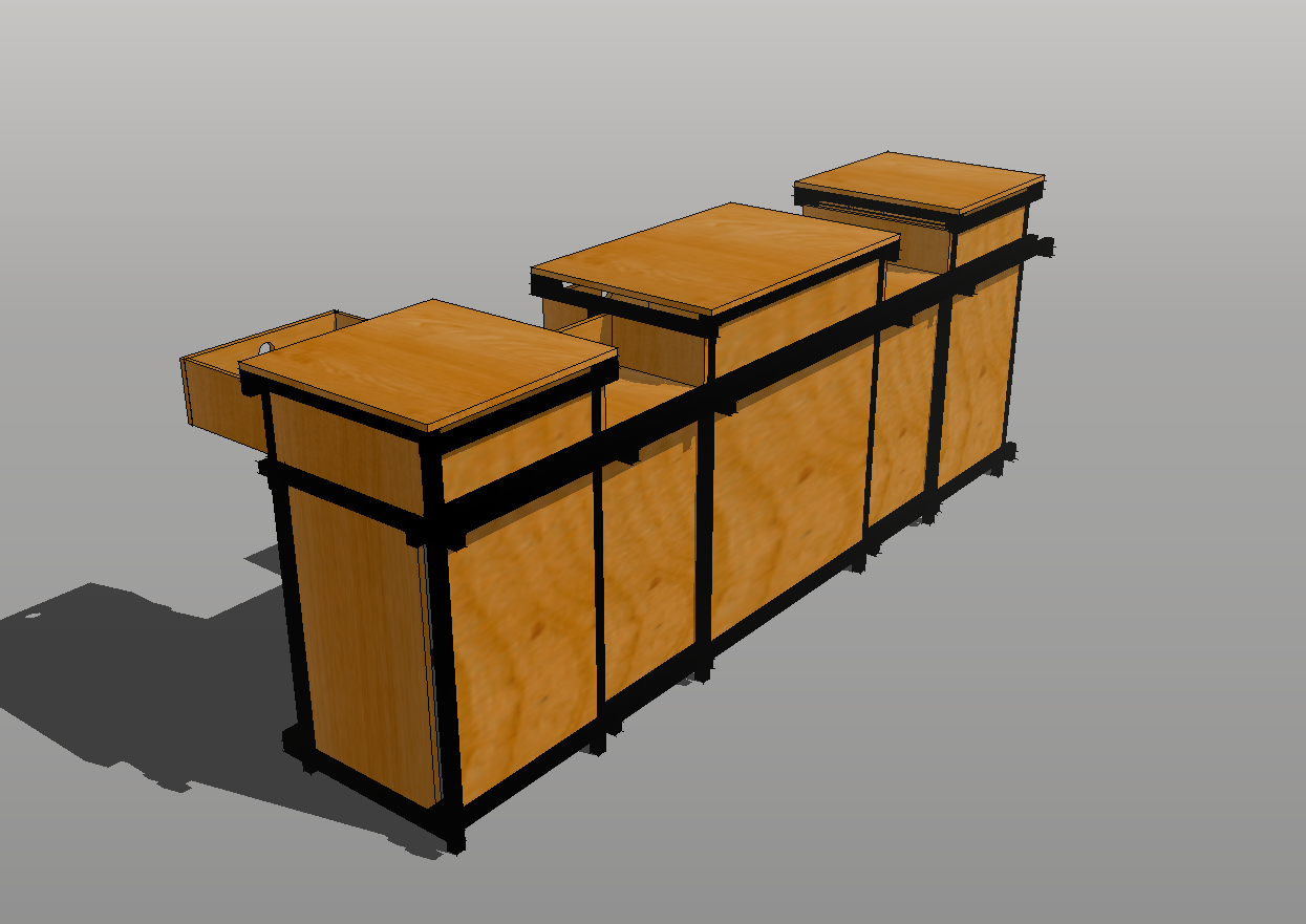
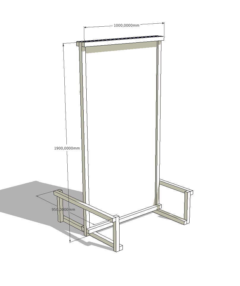
The signage and furniture were designed to create an immersive, distinctive, contemporary, and affordable experience. To achieve this, only square structural iron profiles painted black were used, with Cartesian joints or xyz nodes, also known as "Rietveld joints," widely used by Gerrit Rietveld, an early 20th-century Dutch designer and member of the De Stijl group. These joints were assembled with bolts and nuts, without welding, to facilitate transport, assembly, and the modularity of the system. Natural phenolic multi-laminate was used for the surfaces.
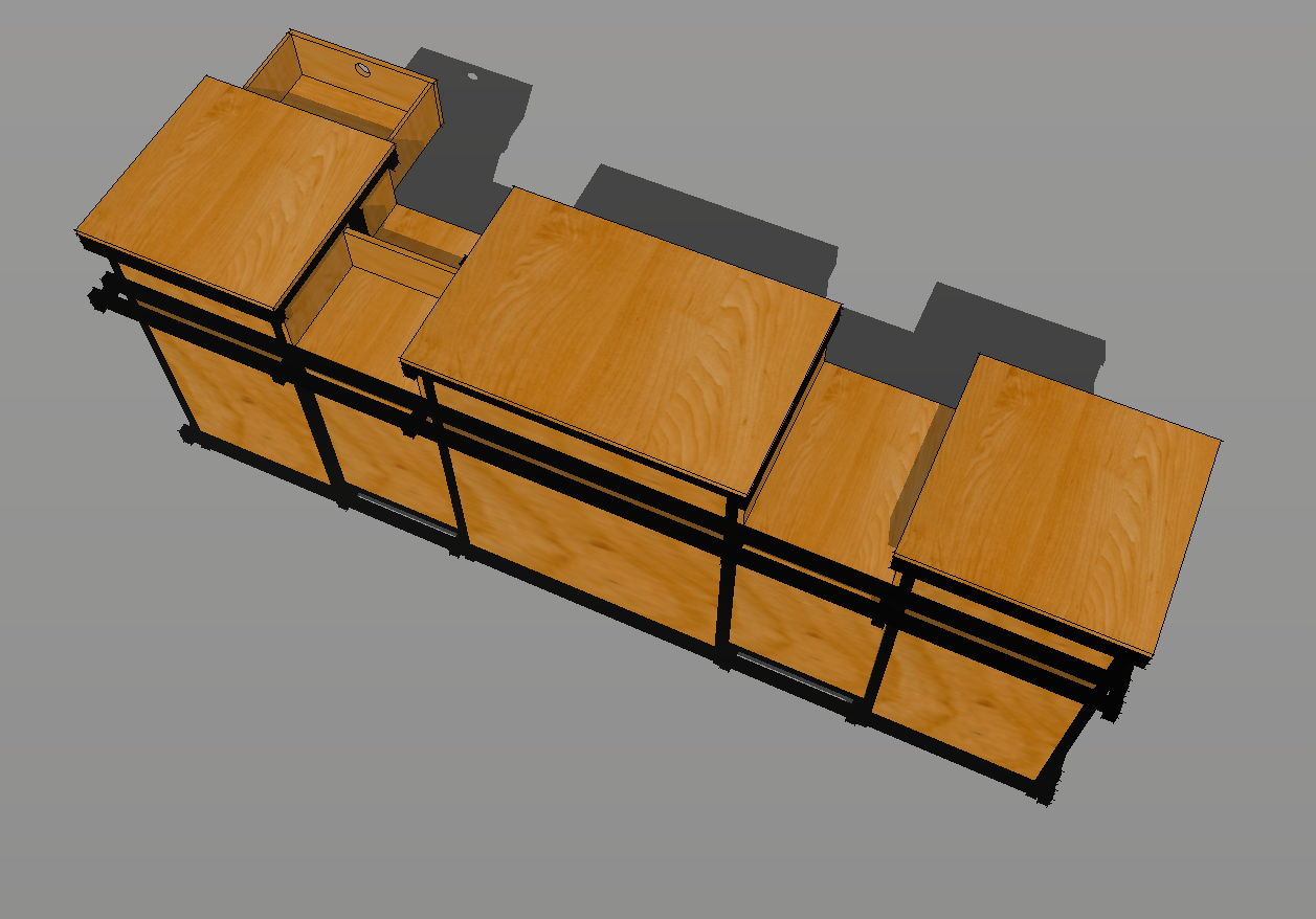
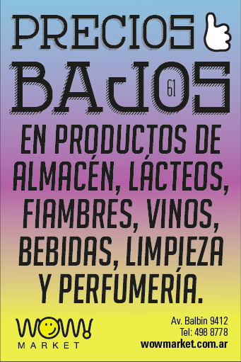
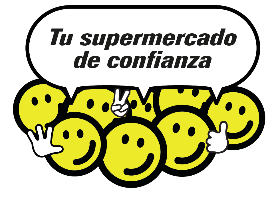
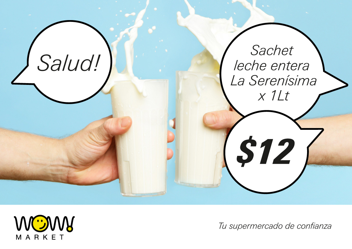
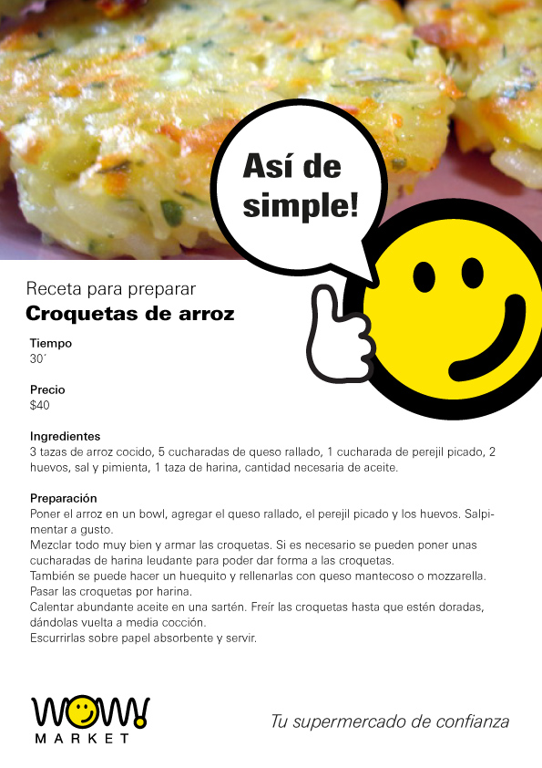
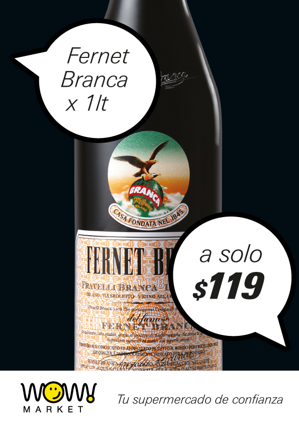
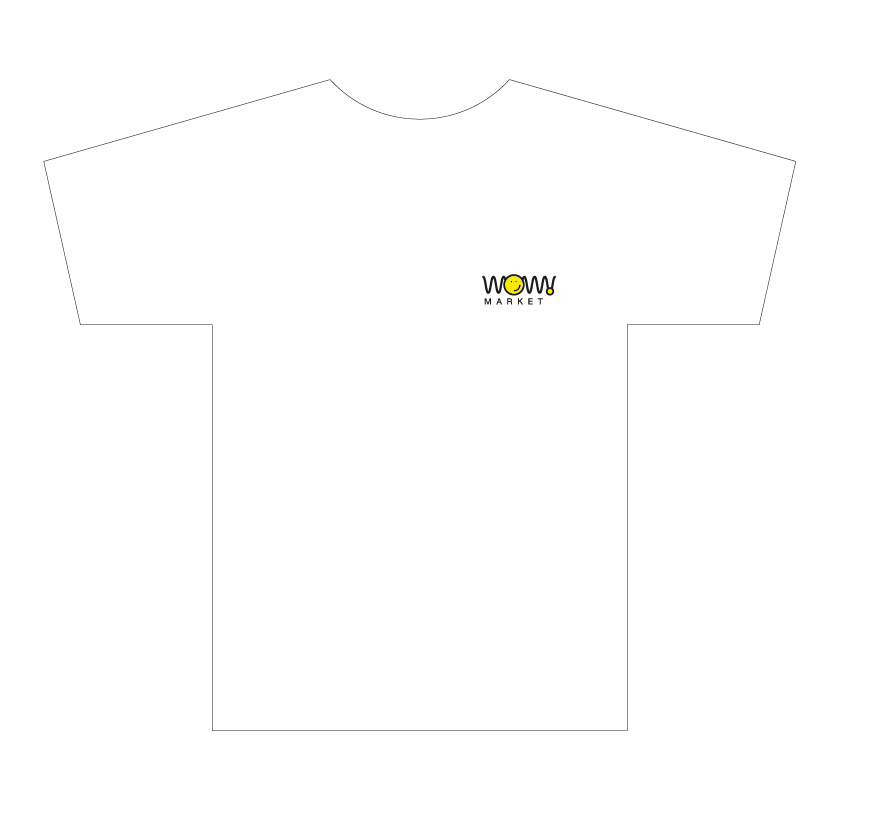
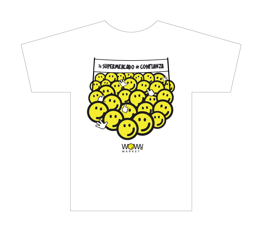
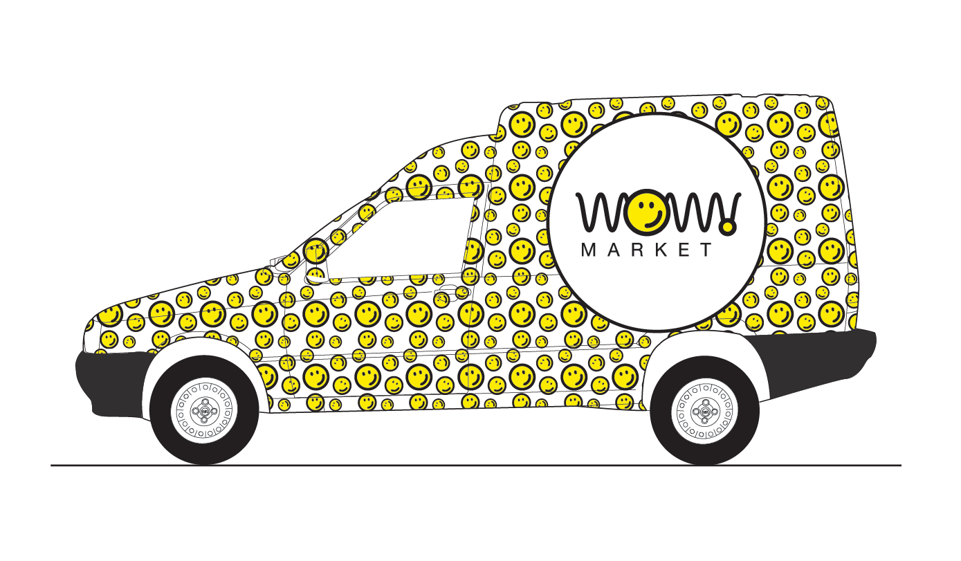
Brand design based on the strength and simplicity of an absolute icon, the “smiley”, united with a wavy line that proposes a game, a continuity of elements that will be transferred to all forms of the identity system of this local supermarket chain. These forms comprise each location and include furniture, staff attire, print and digital communication graphics, vehicle graphics, signage, and totems.Different views of the shelving structures, signage, and checkout counter. The pilot supermarket was built in a space measuring 4 meters wide by 14 meters deep, with a 6-meter-high overhead space and very little room for storage. Therefore, the shelves were projected vertically to increase storage space for immediate replenishment.Proposal and detailed view of a counter structure with space for three registers. The front panels can eventually be replaced with glass or polycarbonate for merchandise display. The modular design easily allows for the design of new units for one, two, three, or more registers, depending on the available space. This proposal was accepted, constructed, and put into operation.Another proposal for a cash register.Sidewalk bulletin board, in the same construction style as the rest of the furniture.Some examples of the printed and digital graphic system in the form of posters, flyers, and social media posts. The communication is simple, direct, and colorful, inspired by street signs with gradient backgrounds and large-format typography, and also through vignettes that feature the logo's smiley face and supposed interlocutors. T-shirts for staff use.Proposal for vehicle branding.