This selection shows some brand design work and, depending on the case, a user manual or applications to give an idea of how the identity system works.
Le Nomade du Soleil (El Nómada del Sol)

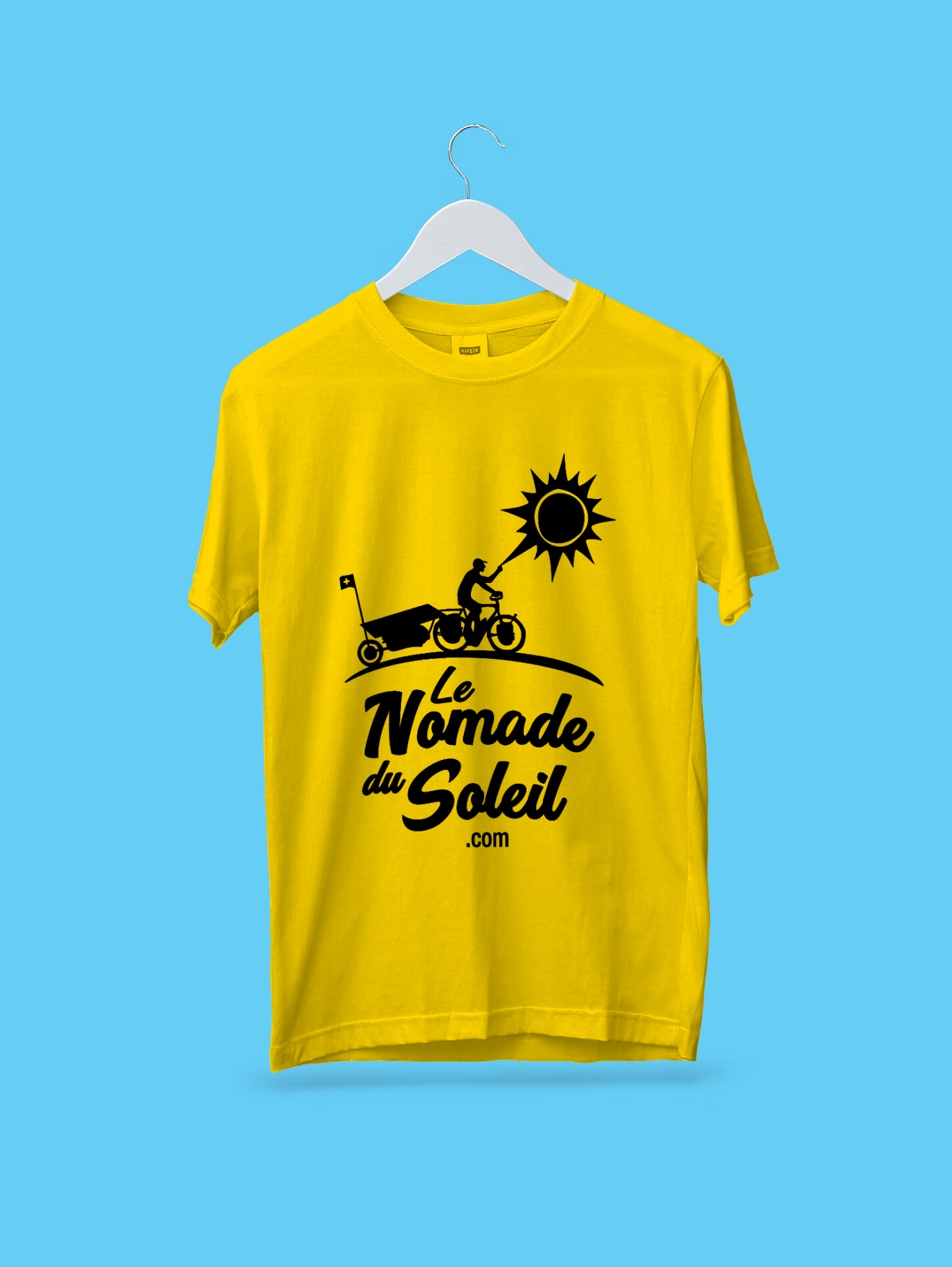
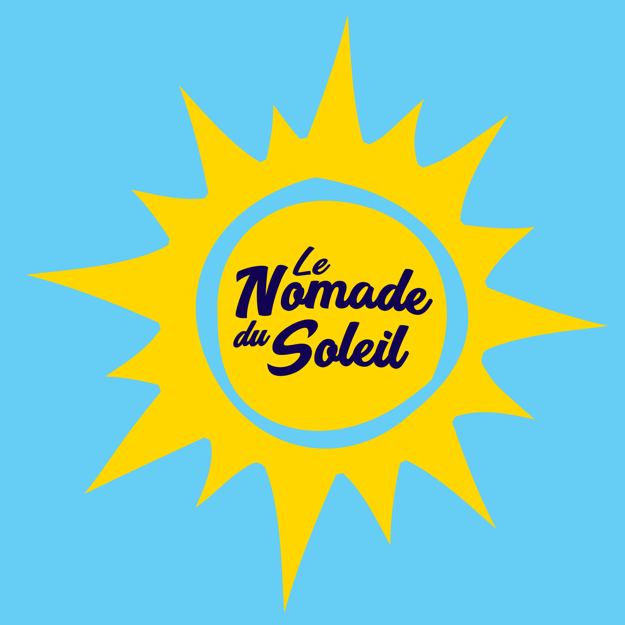
Visual identity for the project of great traveler André Schurch, who, after assembling a bicycle assisted by a motor powered by electricity from a solar panel mounted on a trailer, set out on an epic journey from Greece to China. A schematic logo will help this traveler convey the function of his unusual vehicle as he crosses countries and villages where language and cultural barriers pose a real challenge to expressing complex ideas. The color palette directly references the sun and clear skies, with yellow being an ideal choice to ensure visibility on the road.
Bit You

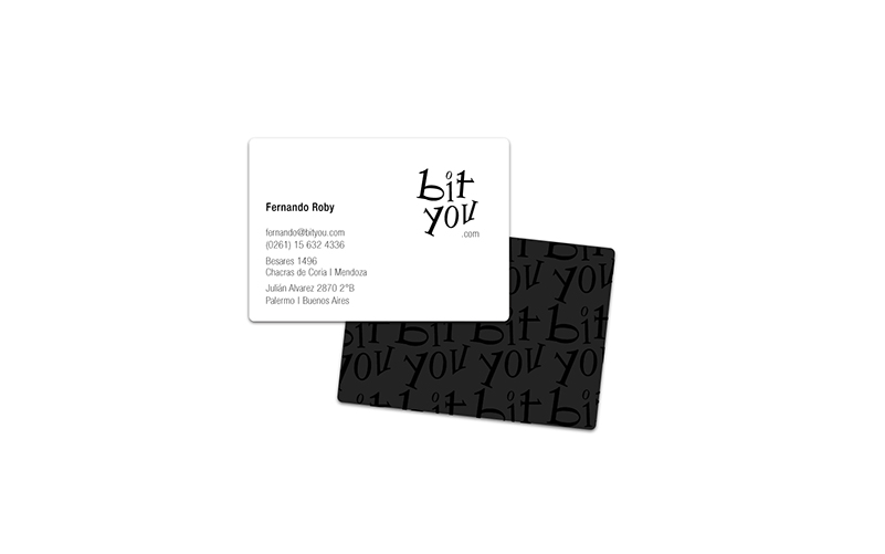
Brand design for an online store selling computer products, where the visual strategy aims to resemble a fashion boutique more than a typical computer shop—seeking refinement and a “chic” feel in order to break away from the stereotypes commonly associated with this sector. The expression “bit you” subtly invites the idea of dressing in or being nourished by bits, and since bits are the smallest unit of information expressed in ones and zeros, the brand's construction is explored through these elements. The result, executed in a Didone or modern Roman typeface—a style frequently used in the fashion world—achieves a balanced blend of the two main objectives: conveying a boutique-like atmosphere and representing the concept of technology.
Below is the path of proposed alternatives and the final outcome of the brand development.
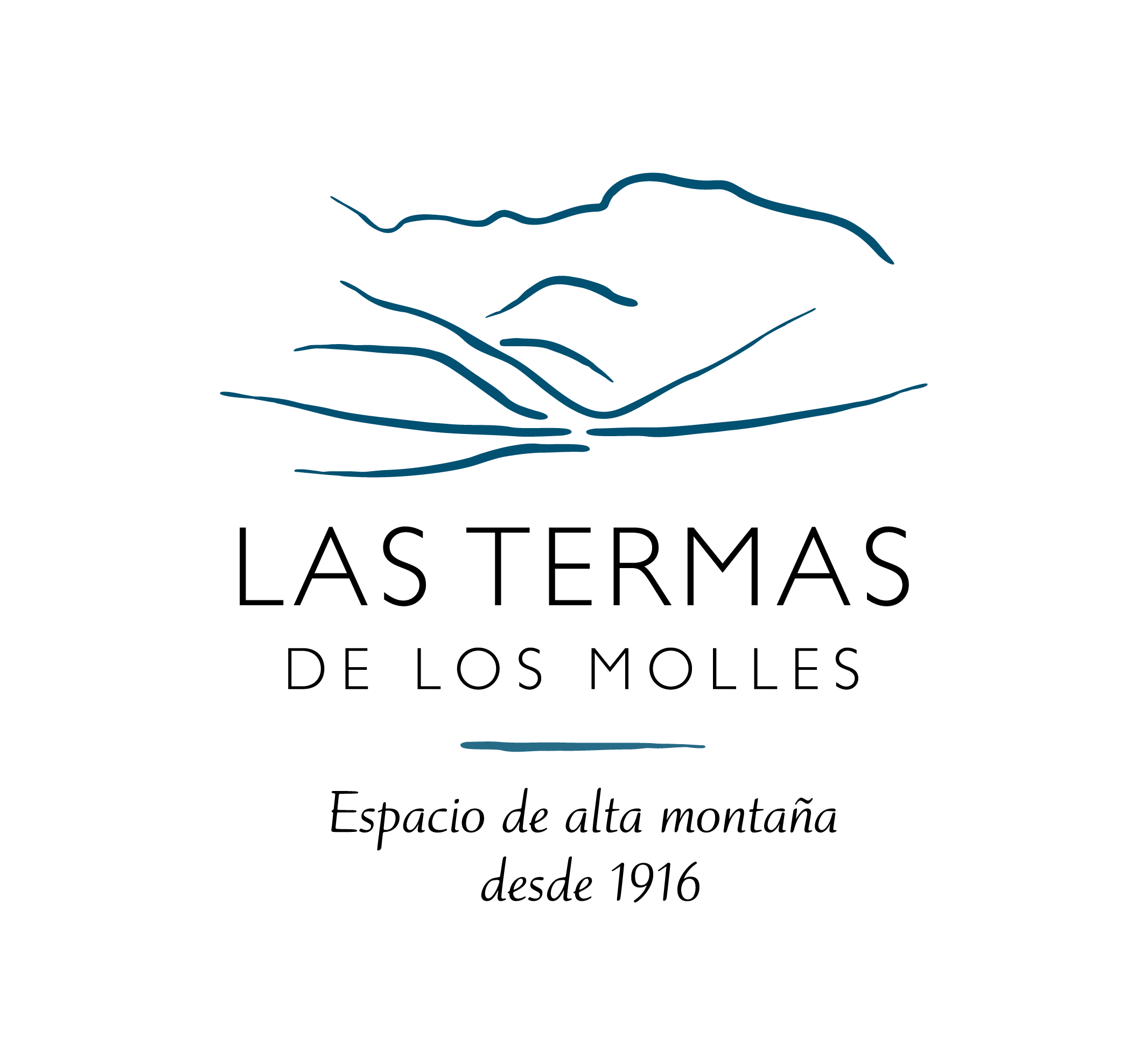
Las Termas de Los Molles
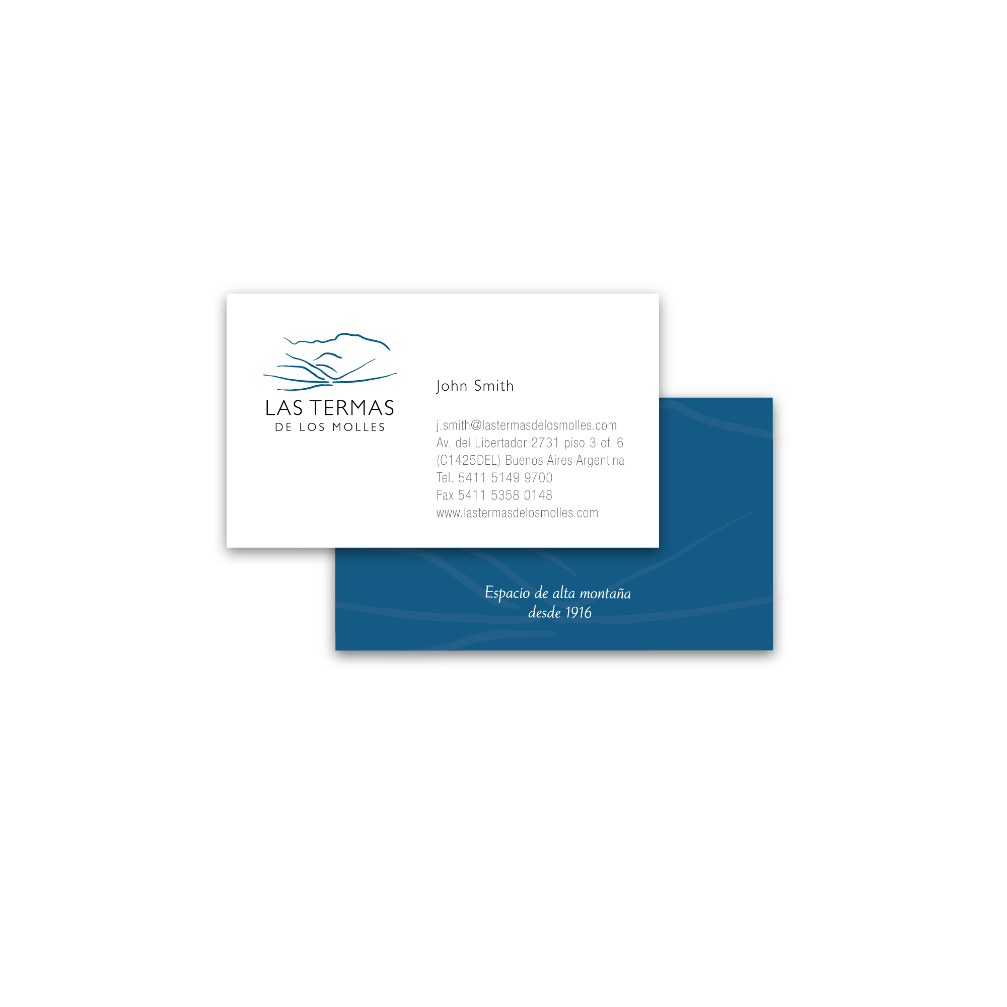
Basic brand guidelines manual.
Café Moro
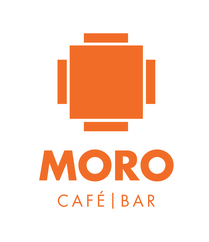
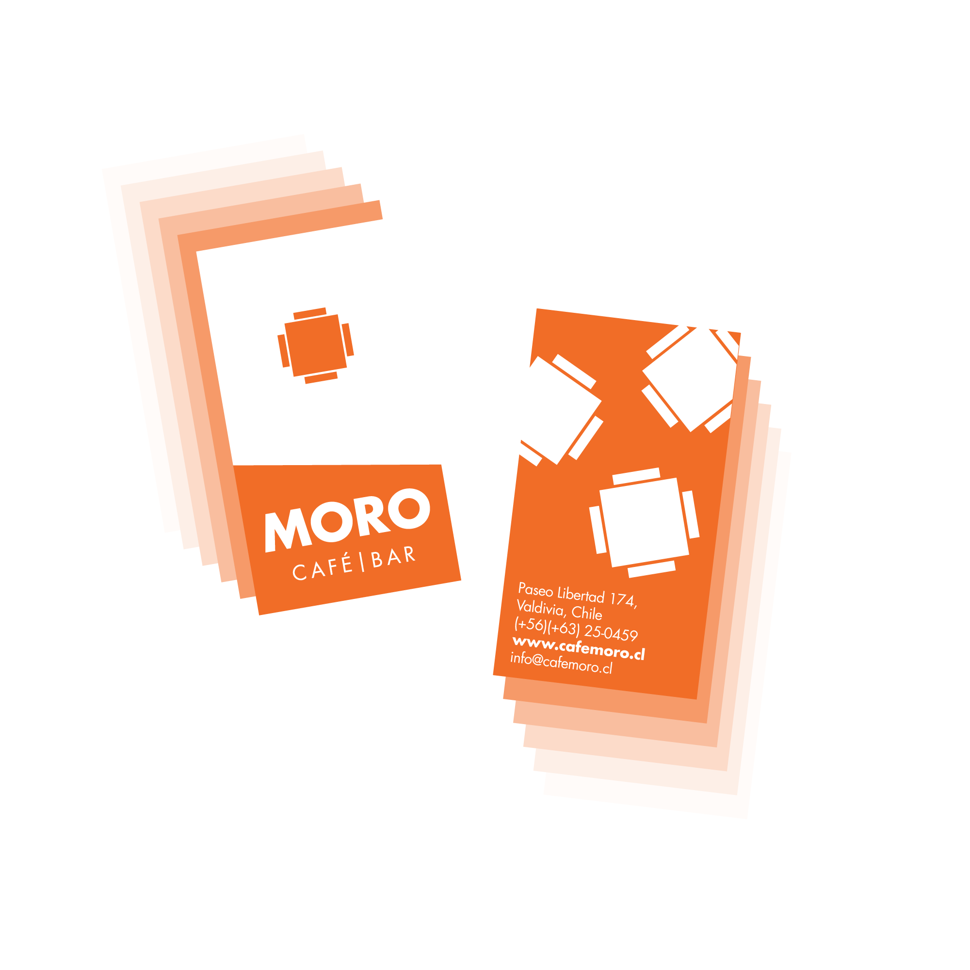

The logo is based on the concept by the artist and owner of the establishment, Isabel Herrera-Basso, representing the layout of a table and four chairs viewed from above. The image is completed with a sans-serif typeface, the use of geometric planes, and the color orange as the main element throughout the visual identity.
Fundación Escotet
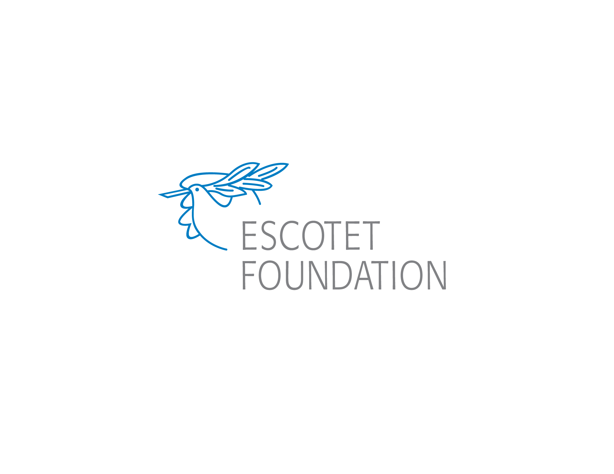
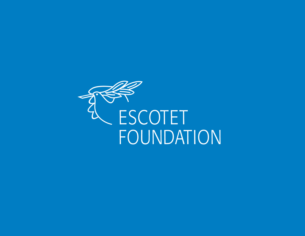
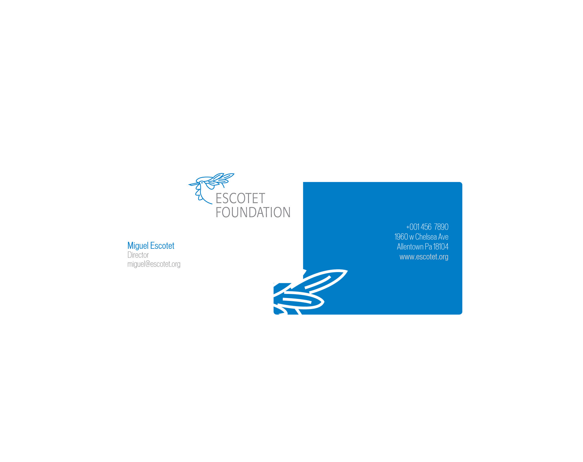
Branding work for an educational foundation based in Miami, Florida, USA. The logo image proposed by the client is based on a work by Pablo Picasso, which was redrawn and combined with the name's typography and the color blue to complete the identity elements for this institution.
Amaco
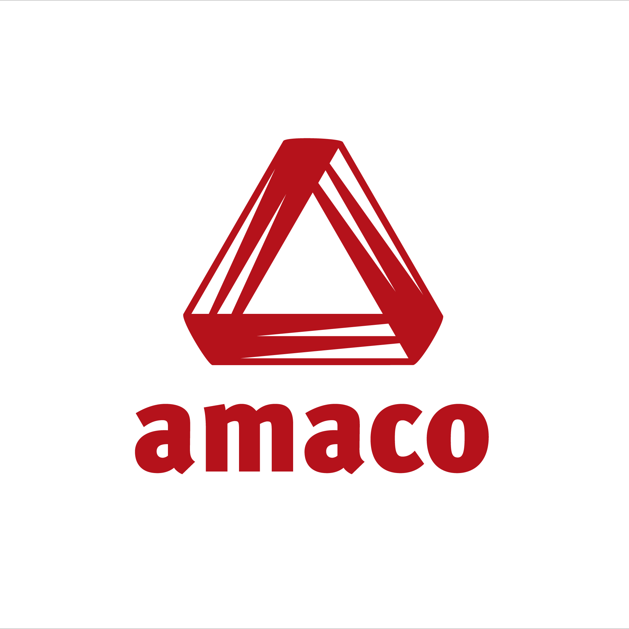
This is a brand redesign project for a construction company based in Rancagua, Chile. It is based on the original logo, which represents an impossible object—in this case, a triangle—that was updated with more dynamic and modern lines. The symbol is anchored by a typeface designed to complement without competing, resulting in a brand that conveys stability and strength, the core values of the company.
Brief guidelines for the proper use of the brand.