BRAND + PACKAGING + BROCHURE DESIGN + WEBSITE Created between 2001 and 2003 for the Final Graphic Design course of the Industrial Design degree (Graphic specialty) at the Faculty of Arts and Design (FAD) of the National University of Cuyo (UNCuyo), Mendoza, Argentina.
Brand
The logo’s creation is based on two distinct associations: on one hand, the (imaginary) basket used to gather apples from the tree that gives the stream its name; and on the other, an analogy between the hatchery and the biblical miracle of the multiplication of loaves and fishes. The simplified sgraffito of the fish recalls the symbol used in Christianity. Without establishing a direct religious connection, this visual resource creates a sign that tells a small story and reflects the artisanal processes that define this small business.
Packaging
The packaging design is perhaps the central element of this identity system. Made from a single folded piece of cardboard, without the need for glue, the packages take the shape of fish that closely echo the brand’s formal language. Their austere graphic treatment reinforces the quiet message conveyed by the form itself.
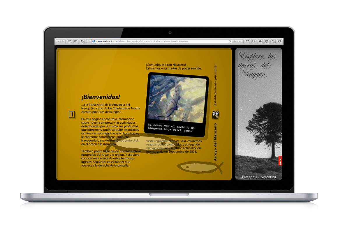
Website
Website design and development: In this part of the system, the brand's fish once again take center stage—this time swimming freely across the screen throughout the entire browsing experience. The site thus takes on the appearance of an aquarium, reinforcing the visual identity while adding a playful and immersive dimension.
Promotional brochure for retail sales.
Promotional brochure for wholesale sales.
Project report.
Image design for a dairy product line, created collaboratively as an introduction to the individual final project.